
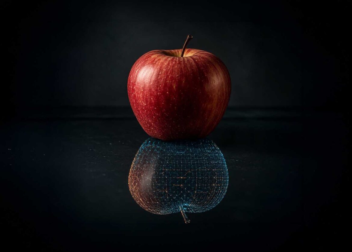
Real or reflection: indistinguishable at first glance.
Image: © Ulrich Buckenlei | XR Stager Online Magazine | VISORIC GmbH
A chart, an analysis overlay, or a technical-looking image doesn’t need to be based on a real measurement to look convincing. Artificial Intelligence can today reproduce the visual language of analysis and detection so precisely that viewers barely stop to ask whether something was actually measured, or whether merely the impression of it was created.
A current example of this comes from the creative industry: an Icelandic creative studio released a series of short videos under the title “faux real,” in which ordinary photos look as if they are being evaluated in real time by an analysis system, complete with tracking lines, labeled boxes, and an impression of depth and spatiality.[1] In reality, no genuine analysis takes place at all, the entire image is a designed illusion.[2]
This article deliberately looks not just at this one example from the creative industry, but at the underlying question that concerns every company working with data, reports, analytics, or AI-driven systems: what was actually measured, what was estimated by an AI, and what was merely generated for display. These three categories increasingly look identical, even though they are fundamentally different in how much they can be relied upon.
What at first looks like an entertaining example from the world of digital art is, in truth, an early sign of a challenge that reaches far beyond creative industries. The more convincingly the appearance of analysis and measurement can be technically produced, the more important the ability becomes to distinguish real data from artificially generated data.
- AI can convincingly reproduce the visual language of analysis and measurement.
- A current example of this is the video series “faux real.”
- The look of an analysis proves nothing about an actual measurement.
- Relevant for every company that works with data and AI systems.
- The key distinction becomes measured, estimated, and generated.
This article explains what a genuine measurement actually consists of, how Artificial Intelligence produces convincing analysis-style visuals without a real basis, what concrete questions can be used to check the difference in everyday business practice, and why traceable origin will become a basic prerequisite for trust.
When an image looks like proof
People instinctively trust visual representations. Measurement lines, percentage values, charts, and technical-looking overlays quickly create an impression of objectivity. But this is exactly where a new problem arises: two representations can look nearly identical, even though completely different processes lie behind them.
On one side stands an actual measurement. A camera or a sensor captures real data. This is processed and evaluated by an analysis system. The result can be traced back to its data source and can additionally state, via confidence values, how certain any single detection actually is.
On the other side, a nearly identical representation can today be created from an ordinary photo using AI and graphic tools. Measurement lines, markings, charts, and even seemingly analytical values can be added as a visual layer, without the depicted properties ever having actually been measured.
The following graphic makes exactly this difference visible. At the top, both results look like the output of a professional analysis system. Only a look at the production chain below reveals that just one side is based on actual data capture and analysis.
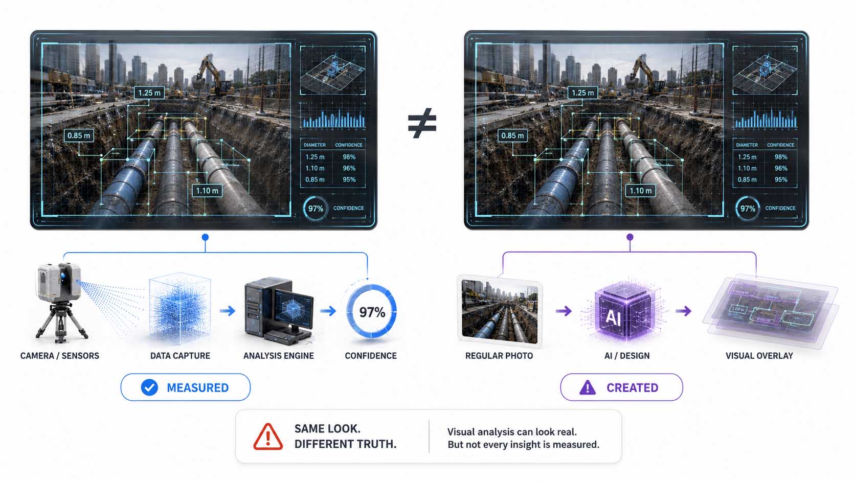
Same look, different foundation.
Infographic: the difference between an actually measured analysis and a visually generated analysis look | Graphic: © Ulrich Buckenlei | XR Stager Online Magazine | VISORIC GmbH
The video series “faux real” by Ingi Erlingsson, mentioned at the outset, works with exactly this perceptual effect. Ordinary source images receive a visual language that we immediately associate with technical analysis: markings, lines, spatial layers, and labeled regions. As a result, the representation looks like the output of a running analysis system, even though the analysis look itself was designed.
What matters here, therefore, is not a single creative effect. What matters is that the visual language of a measurement can now be produced independently of the measurement itself. What works for an art project can equally be applied to presentations, marketing materials, reports, or other corporate information.
For companies, this results in a simple but important rule: the professionalism of a visualization is no proof of the quality or existence of the underlying data. What matters is the production chain behind the visible result.
- Two analysis images can look nearly identical yet rest on entirely different foundations.
- A real analysis begins with a traceable data or sensor source.
- AI and design tools can produce the same visual language without any corresponding measurement.
- Confidence values and data provenance therefore become more important than the pure look.
- For companies, what will matter in the future is not just what a representation shows, but how it came about.
This leads the decisive question directly from the visible result to its origin: what technically distinguishes actually measured information from a convincingly designed representation? That is exactly what the next chapter addresses.
What a genuine measurement actually consists of
A system that actually measures does not just mark what it sees, it also provides information about how precise and how certain a single detection is. A simple example from image recognition: a system first locates a person or an object roughly within an image and marks this area with a frame.
A more precise system goes a step further and detects individual characteristic points, so-called keypoints, such as shoulders, elbows, wrists, or knees. From their position and relationship to one another, the posture or movement of a person can then be derived.[5] While a rough marking merely indicates that something is located at a certain spot, such keypoint detection describes far more precisely how this object or person is actually positioned in space.
Confidence values can be output for these individual detections, indicating how certain the system is about a given assignment.[6] Shoulder, elbow, or wrist, for instance, can each carry different confidence values. This assessable uncertainty is a key difference from a purely design-based reproduction of an analysis look: an artificially generated graphic can likewise display percentage values, but these do not prove an actual measurement unless they emerged from a traceable analysis process.
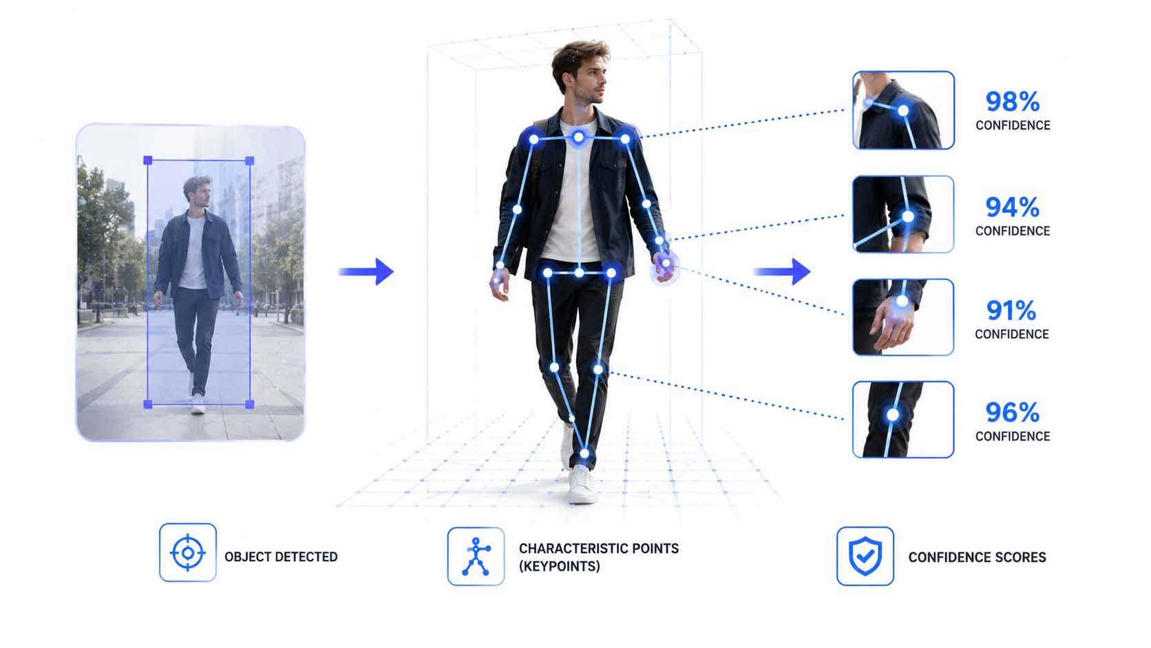
From rough marking to precise measurement.
Infographic: from rough object detection through characteristic keypoints to the confidence values of individual detections | Graphic: © Ulrich Buckenlei | XR Stager Online Magazine | VISORIC GmbH
For a professional analysis system, such confidence values are not decorative extras, but an important part of the output. They allow downstream systems or human decision-makers to assess how much a single detection can actually be trusted, instead of automatically treating every output as an established fact.
This also makes clear why the pure look of an analysis is not sufficient to judge its reliability. What matters is not whether a frame, a measurement point, or a percentage figure is visible, but whether this information emerged from a traceable data capture process and an actual analysis.
This foundation, what a system actually detects and with what certainty it makes that statement, is the benchmark against which any visually similar representation has to be measured. How Artificial Intelligence can additionally create the impression of spatial depth from a single flat photo is shown in the next chapter.
- Rough detection first only locates a person or an object within the image.
- Keypoints capture characteristic points such as shoulder, elbow, wrist, or knee.
- Posture and movement can be derived from the relationship between these points.
- Confidence values show how certain the system is about individual detections.
- Displayed percentage values alone do not prove an actual measurement.
Anyone who knows this foundation can more easily tell whether a technical representation is based on a real analysis or merely imitates its visual language.
How a single photo creates a sense of space
A second central building block of such effects is the impression of spatiality. An ordinary photo is initially flat, it contains no direct information about how far individual image regions actually are.
Artificial Intelligence can estimate this missing information from a single, ordinary image, with no additional sensors at all. The model learns visual cues such as perspective, object size, and shading to estimate a distance for each region of the image.[7] The result is a dense map of estimated values, with each point in the image carrying an estimated distance to the camera.[8]
Once this estimate is available, the image can be broken down into several layers, based on the estimated distance of each image region. If these layers are then shifted slightly against one another, the impression arises of a torn-open, physically pulled-apart space, even though only a single, flat source image still exists.
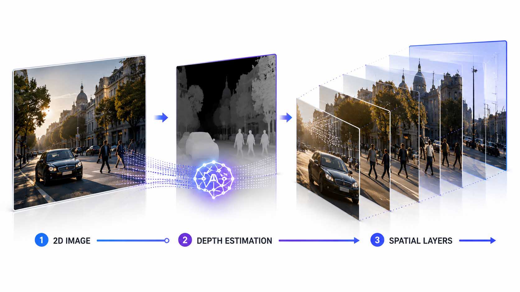
From flat photo to estimated depth to staggered layers.
Infographic: how an AI-driven estimate breaks a single photo down into spatially convincing layers | Graphic: © Ulrich Buckenlei | XR Stager Online Magazine | VISORIC GmbH
For applications such as robotics or industrial free-space detection, this kind of estimation is by now practically usable, precisely because it requires no additional sensor hardware and relies on a single, ordinary image.
For the creative application, however, the same technique means something different: it provides the technical basis for a single photo to appear spatial, regardless of whether a real measurement or a purely designed look is layered on top afterward. How this additionally produces the convincing impression of a running analysis is shown in the next chapter.
- AI can estimate missing depth information from a single image.
- This estimation requires no additional sensors.
- The result is an estimated distance for every region of the image.
- Shifted layers create the impression of a torn-open space.
- The source image remains, throughout, a single, flat photo.
This technique is neutral in itself, it only provides the spatial foundation. What is layered on top of it afterward decides whether the result is a real analysis or pure design.
When the appearance of an analysis becomes a design tool
On top of the spatially prepared scene, such an effect additionally places a graphic layer with lines, points, and labeled markings that look like a running analysis. These elements are designed by hand, not the output of an actually working system.
The decisive difference lies in the fact that a real system delivers a justified uncertainty with every output, while a designed graphic layer can appear arbitrarily precise and arbitrarily confident, regardless of whether anything was actually captured at all. Even technically mature AI models remain confronted with real-world challenges such as lacking scale accuracy or limited transferability to new environments.[9] A designed look naturally knows no such limitations, because it simply doesn’t have to represent them.
On top of that comes a fundamental problem of genuine estimation methods: the task of deriving a three-dimensional property from a single two-dimensional image is mathematically underdetermined, because direct geometric cues are missing and the estimate must instead be derived from learned patterns.[10] A purely designed look does not need to solve this fundamental problem at all, it can simply reproduce the visual language of an already-solved task.
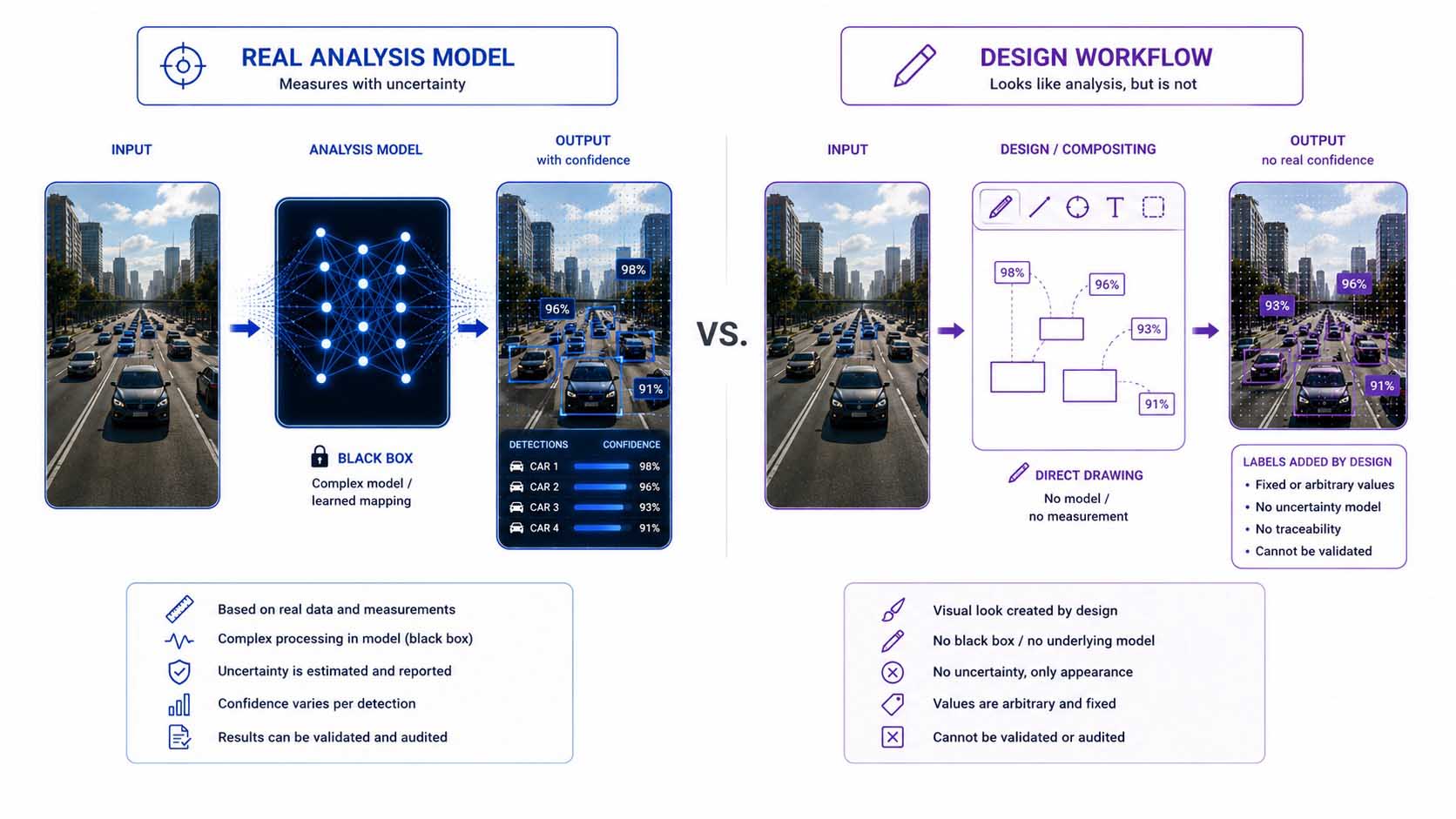
A system measures with uncertainty, a design draws without it.
Infographic: the structural difference between a genuine analysis model and a purely designed reproduction of that look | Graphic: © Ulrich Buckenlei | XR Stager Online Magazine | VISORIC GmbH
For viewers, this difference is practically undetectable in the finished image. Both variants show exactly the same visual language, lines, points, labeled markings, only one of the two variants is based on an actual measurement subject to uncertainty.
This makes clear why a technically convincing-looking representation alone says nothing about the actual function behind it. How a single creative process can today take over several previous production steps at once, and why that accelerates the spread of such effects, is shown in the next chapter.
- Real systems fundamentally deliver a justified uncertainty with every output.
- Designed looks can appear arbitrarily confident, without any measurement.
- Estimation from a single image remains mathematically underdetermined.
- A designed look does not actually need to solve this problem.
- In the finished image, both variants are visually almost indistinguishable.
This very invisibility of the difference in the final result is at the core of the challenge explored further in the following chapters.
Why such effects are so easy to produce today
What additionally accelerates this development is the reduced production effort behind it. Various AI tools, depth estimation, image generation, and video generation, can today be combined within a single, connected working environment, where individual processing steps are assembled like building blocks.[11]
Processes that previously required several specialized production stages and different tools can increasingly be orchestrated within a single workflow as a result.[12] Publicly accessible templates additionally make this combination usable for a broader audience, without every single step having to be developed from scratch.
For the convincing analysis look, this means concretely: a single person with freely available tools can today produce effects that previously would have required an entire team, and this is by no means limited to videos in the creative industry anymore.
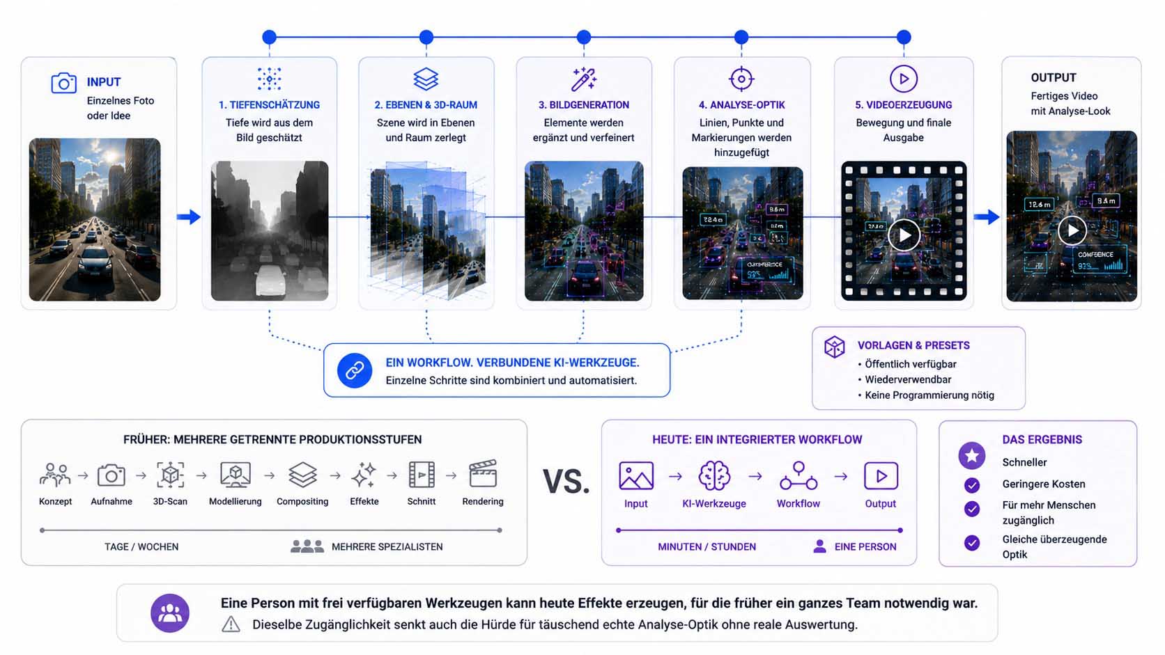
A connected workflow instead of several separate production steps.
Infographic: how connected AI tools bring together earlier production chains within a single workflow | Graphic: © Ulrich Buckenlei | XR Stager Online Magazine | VISORIC GmbH
This accessibility is both an opportunity and a challenge at once. It opens up new possibilities for education, communication, and interactive experiences, but at the same time lowers the barrier for producing a convincing analysis look without a real evaluation behind it.
This very lowered barrier is the reason why the distinction between measurement, estimation, and design is becoming increasingly practically relevant for every data-driven company. That is shown in the next chapter.
- Various AI tools can today be combined within a single workflow.
- Earlier production chains can be orchestrated within one workflow.
- Public templates further lower the barrier to entry.
- A single person can today produce team-level effects.
- The same accessibility also lowers the barrier for deceptive visuals.
This technical democratization changes who can produce such effects, and makes the question of the actual basis behind them all the more urgent.
How the difference can be recognized in practice
The growing spread of convincing but not necessarily measured representations is by now far from a niche topic in the creative industry. A technically convincing-looking chart, an analysis overlay in a marketing video, or an AI-generated image in an internal report fundamentally proves nothing about the actual basis behind it. The decisive question, therefore, is not whether a representation looks convincing, but whether its origin can be concretely verified.
In practice, this verification can be broken down into a manageable set of questions that can be asked of any data source, regardless of whether it concerns a chart, an image, or a spatial representation. Does a confidence or uncertainty statement exist for every individual claim, or does the representation appear uniformly confident throughout? Can the output be traced back to a concrete sensor source or raw data capture, or does the chain end at a mere description? Does the content carry a cryptographically signed provenance credential under an open standard such as C2PA, or merely classic, easily alterable metadata that carries no evidentiary value at all?[13] And can the result be independently reproduced under a repeated measurement, or was it generated once for a specific purpose?
Anyone who consistently asks these four questions, whether of a service provider, an internal department, or an AI-driven tool, shifts the check from pure appearance to actual traceability. A provider selling a representation as a genuine measurement should be able to answer these four questions without evasion. If one remains unanswered, that is not proof of deception, but a clear signal for additional caution.
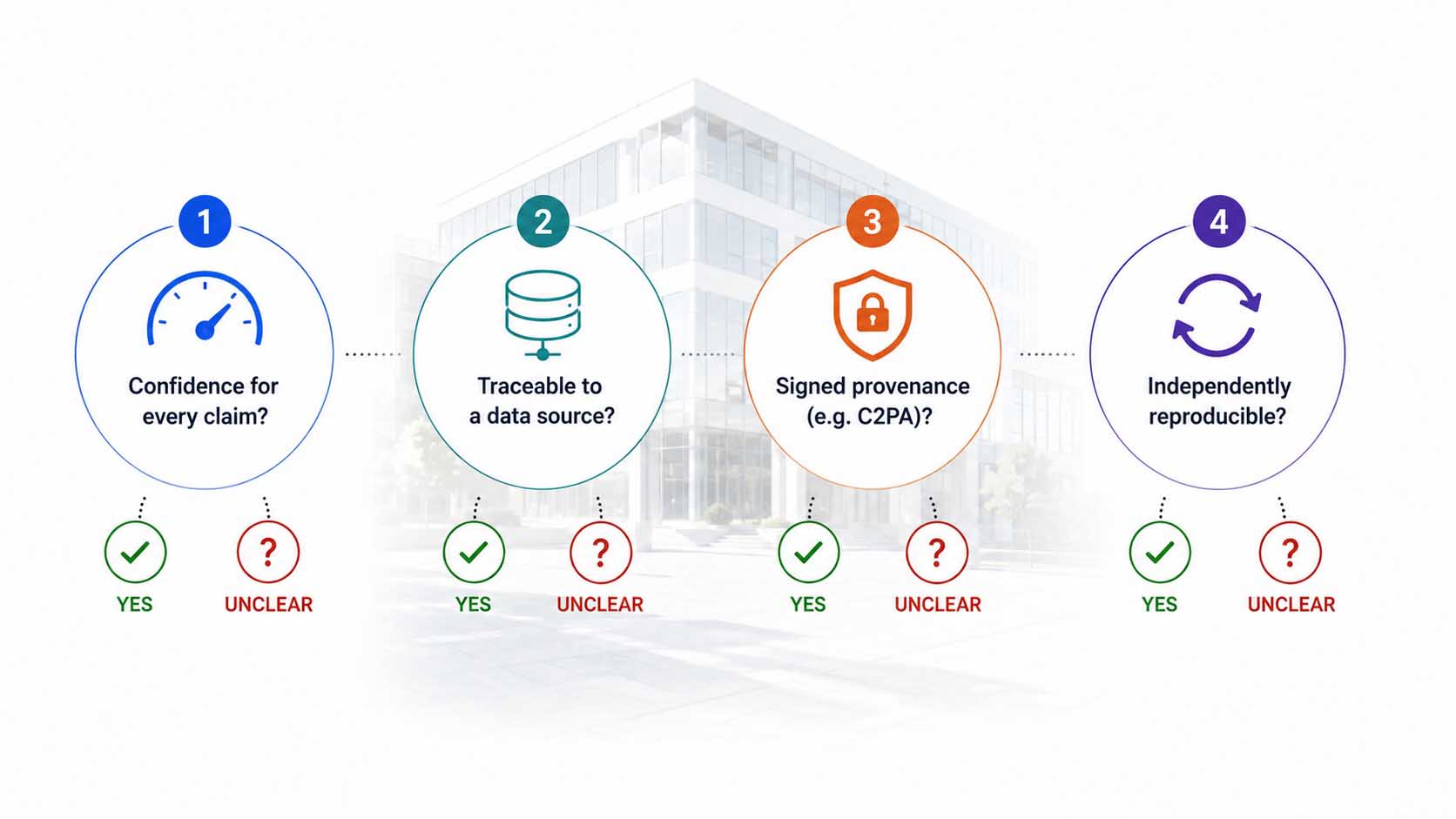
| Verification Question | Measured | Estimated | Generated |
|---|---|---|---|
| Confidence value present for every claim | Yes | Partly | No |
| Traceable to a specific sensor source | Yes | Partly | No |
| Signed provenance credential instead of plain metadata | Possible | Possible | Rare |
| Result independently reproducible | Yes | Partly | No |
Four questions that can be asked of any data source.
Table: the four verification questions compared across measured, estimated, and purely generated information | Source: own assessment based on current provenance standards, as of summer 2026 | © Ulrich Buckenlei | XR Stager Online Magazine | VISORIC GmbH
This practical effectiveness, however, depends decisively on the entire chain remaining consistently standard-compliant, from the creation tool to the distribution platform, a state that has not yet been broadly achieved.[14] Precisely because of this, these four questions do not replace a technical solution, they are the pragmatic first step that every company can already apply today, regardless of how far provenance standards have already spread within its own industry.
For a company that creates its own visualizations, reports, or marketing materials using AI-assisted editing, the same check applies in the opposite direction: anyone who uses a designed analysis look as a stylistic device should disclose this distinction between design and actual measurement of their own accord, rather than waiting for someone to ask the four questions.
This verification practice leads directly to a more fundamental distinction that reaches far beyond individual companies. That is shown in the next chapter.
- Question 1: Does a confidence value exist for every claim?
- Question 2: Can the output be traced back to the sensor source?
- Question 3: Is there a signed provenance credential instead of plain metadata?
- Question 4: Is the result independently reproducible?
- Unanswered questions are not proof, but a clear signal for caution.
This makes clear that this challenge is not purely technical, but a concrete verification practice that can be applied in everyday business.
Measured, estimated, or generated: the new trust question
Behind the single example lies a more fundamental three-way division that is gaining increasing importance: information can have been actually measured, it can have been estimated by an AI from available data, or it can have been generated purely for display, with no connection whatsoever to a real measurement.
This is exactly where current approaches to provenance credentials come in. A layered approach of open standards, durable labeling signals, and public verification tools is meant to make the origin of content traceable in the future, with plain metadata alone explicitly not counting as a sufficient credential.[15] Regulatory developments additionally reinforce this trend: rules such as the EU AI Act increasingly require that AI-generated content be clearly and recognizably labeled, insofar as it could be mistaken for genuine, human-made content.[16]
For companies that make decisions based on data or AI outputs, this distinction becomes a matter of trust. It is no longer enough to know what result an evaluation arrived at, what additionally becomes decisive is whether the underlying information was measured, derived, or generated.
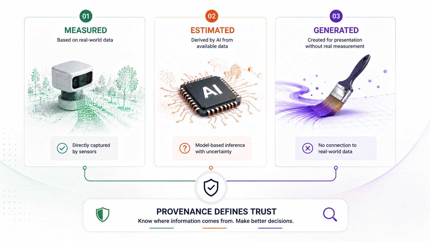
Three categories, one shared question of trust.
Infographic: the distinction between measured, estimated, and generated information as a foundation for trust | Graphic: © Ulrich Buckenlei | XR Stager Online Magazine | VISORIC GmbH
For companies that operate AI-driven systems themselves or use their outputs, this three-way division is increasingly becoming a practical requirement, not merely an academic distinction.
This finally raises the question of how trust in data and systems can be maintained over time. That is shown in the final chapter.
- Information can be measured, estimated, or purely generated.
- Layered standards are meant to make origin traceable in the future.
- Plain metadata explicitly does not count as sufficient on its own.
- Regulation such as the EU AI Act increasingly requires clear labeling.
- The origin of information, not just the result, is becoming decisive.
This question of origin is not a purely technical detail, but the foundation for how much trust can be placed in data and systems at all going forward.
Why trust requires a traceable origin
Zooming out from the individual example reveals a principle that reaches far beyond a single video series or a single creative studio. The more easily the appearance of analysis and measurement can be technically produced, the more important a traceable, visible chain becomes, from the original capture to the final representation.
This very principle lies at the heart of every reliable, data-driven system, regardless of whether it concerns a corporate dashboard, a market report, or a spatial representation of a real location: reliability arises from the fact that it remains traceable at all times which information was actually captured and which was merely supplemented or displayed.[17] Current industry analyses confirm that exactly this connection between sensors, Artificial Intelligence, and representation is gaining importance across industries in 2026, from consumer applications to industrial systems.[18]
For companies relying on data and AI-driven systems, a clear strategic consequence follows from this: the more convincingly the appearance of analysis can be produced independently of real measurement, the more valuable a system becomes that considers its own provenance chain from the outset, rather than generating trust solely through the visual persuasiveness of its representation.
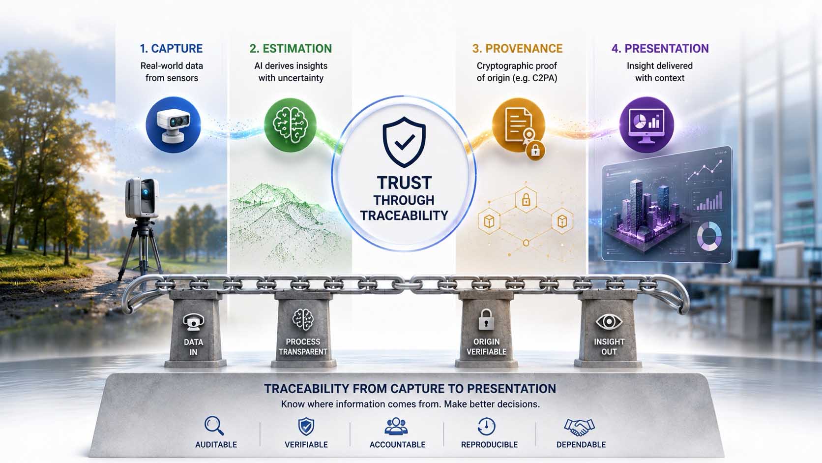
From a single effect to a foundational principle of trustworthy systems.
Infographic: why a traceable provenance chain is at the core of every trustworthy, data-driven system | Graphic: © Ulrich Buckenlei | XR Stager Online Magazine | VISORIC GmbH
This closes the circle of this article. What begins as an entertaining visual effect leads directly to one of the central questions facing every data-driven company: not just what a system shows, but where that information actually comes from. Just how convincing the starting point of this principle already looks today is shown in the video below.
- Traceable origin is central to every reliable, data-driven system.
- Sensors, AI, and representation are converging across industries.
- Trust arises from traceability, not from visual persuasiveness.
- This question affects consumer applications just as much as enterprise systems.
- The provenance chain belongs in the system architecture from the start.
This very traceability is the benchmark against which any system should be measured that claims to capture and represent real-world conditions.
When a video looks like a running analysis system
The preceding chapters have shown what a genuine measurement consists of, how Artificial Intelligence gives a flat image spatial depth, and why the appearance of an analysis can be reproduced by design independently of that. Just how convincing this principle already looks in practice today is most vividly demonstrated by the example mentioned at the outset.
Embedded here is an example from the video series “faux real” by Ingi Erlingsson, in which an ordinary photo is visibly transformed into a spatially torn-open scene with tracking lines and labeled boxes.[2]
This moment, experiencing a seemingly running analysis in real time, illustrates what was explained technically in the previous chapters: an AI-driven estimate provides the spatial foundation, a video model animates the resulting layers, and an additional graphic layer creates the impression of a running evaluation on top of it, without that evaluation actually taking place.
Video: example from the video series “faux real” by Ingi Erlingsson, an AI-driven simulation of a running analysis | Visuals by Ingi Erlingsson (@ingi.ai / @ingi_erlingsson) | Analysis, script, editing, and video production: © Ulrich Buckenlei | XR Stager Online Magazine | VISORIC GmbH
The video makes clear how precisely the visual language of a running evaluation can be reproduced today, with lines, points, and labeled markings that look exactly like the output of a real system. For every company working with data, reports, or visual evaluations, this example makes tangible why a convincing look alone is never sufficient proof of an actual measurement.
At the same time, the video makes visible the decisive point from Chapter 2: a real system delivers a confidence value with every detection, a designed look knows no such uncertainty. It is precisely this invisible difference that separates a convincing simulation from an actual evaluation.
- Video shows an example from the video series “faux real.”
- An AI-driven estimate provides the spatial foundation of the effect.
- An additional graphic layer creates the impression of an analysis.
- An actual evaluation never takes place at any point.
- Missing confidence values remain the decisive, invisible difference.
This example makes tangible why the distinction between measured, estimated, and generated information is becoming a basic competency for every data-driven company, far beyond a single viral video.
From a convincing look to a trustworthy system
A reliable, data-driven system does not come from a convincing-looking representation alone, but from a traceable, unbroken chain from the actual capture to the final visualization, exactly the combination at the core of VISORIC’s work.
The expert team at VISORIC GmbH in Munich combines over 15 years of experience in 3D, AI, and XR with hands-on experience in spatial computing, real-time 3D, and digital twins, exactly the foundation that also matters for the responsible use of AI-driven visualization in companies, whether it concerns product visualization, training, or the spatial representation of real locations. VISORIC helps companies cleanly separate AI-driven representation from actual measurement data and bring both together into a reliable, permanently usable application.

15 years of experience in 3D, AI, and XR: the VISORIC expert team from Munich.
Image: © Ulrich Buckenlei | XR Stager Online Magazine | VISORIC GmbH
A well-thought-out pilot project, a single use case, a clearly scoped visualization solution, can often be realized considerably faster and more cost-effectively than many companies expect. VISORIC accompanies this path from the first concept through technical implementation to a fully operational, trustworthy application.
- Advice on cleanly separating measurement data from visualization.
- Development of traceable, trustworthy spatial computing applications.
- From pilot application to a company-wide digital twin solution.
That is exactly the right starting point for a conversation: not the big, company-wide vision, but a clearly scoped, quickly implementable first step that shows how convincing visualization and real measurement data can be combined cleanly and traceably.
Do you want to find out how AI-driven visualization and real measurement data can be cleanly separated in your company, and still meaningfully combined?
Talk to the VISORIC expert team in Munich about spatial computing, real-time 3D, and trustworthy digital twins. Together, we’ll turn your requirements into a precise, traceable application, with a tangible advantage in data quality, transparency, and trust.
Contact:
Email: info@visoric.com
Phone: +49 89 21552678
Sources and References
- Instagram @ingi.ai, video series “faux real.”
- Instagram @ingi.ai, video series “faux real,” example clip.
- CoinDesk. NFT Collection Doodles Acquires Emmy-Nominated Animation Studio. coindesk.com, January 2023.
- Ingi Erlingsson (@ingi_erlingsson). Post on the move to his own AI studio. X, December 2024.
- Viso.ai. Real-Time Pose Estimation in Computer Vision. viso.ai.
- Baeldung. How Does Pose Estimation Work? baeldung.com/cs/pose-estimation.
- Ultralytics. What Is Monocular Depth Estimation? An Overview. ultralytics.com, 2026.
- Ultralytics. Ultralytics YOLO26 Now Supports Monocular Depth Estimation. ultralytics.com, 2026.
- Viso.ai. Monocular Depth Estimation, 3D Scene Geometry from 2D. viso.ai.
- EmergentMind. AI-Based Monocular Depth Estimation. emergentmind.com, 2025.
- comfy.org/workflows/ingi, public profile and published workflow templates.
- ComfyUI (official X account), livestream announcement on custom LoRAs and motion graphics nodes.
- AI Buzz. AI Watermarking 2026, C2PA, Metadata and Fingerprinting. aibuzz.blog, June 2026.
- Eyesift. C2PA Adoption Status 2026, Content Credentials, OpenAI and Google. eyesift.com, June 2026.
- OpenAI. Advancing Content Provenance for a Safer, More Transparent AI Ecosystem. openai.com.
- AI Buzz. Digital Provenance Explained, Content Credentials and C2PA 2026. aibuzz.blog, May 2026.
- ISO 23247. Reference framework for digital twins, general definition and core principle.
- Spatial Computing Industry Research Report 2026. GlobeNewswire, February 2026.
- VISORIC case studies in digital twins, real-time 3D, and spatial computing.
- XR Stager platform for real-time 3D, digital twins, Knowledge AI, and industrial spatial computing applications.
Contact Us:
Email: info@xrstager.com
Phone: +49 89 21552678
Contact Persons:
Ulrich Buckenlei (Creative Director)
Mobil +49 152 53532871
Mail: ulrich.buckenlei@xrstager.com
Nataliya Daniltseva (Projekt Manager)
Mobil + 49 176 72805705
Mail: nataliya.daniltseva@xrstager.com
Address:
VISORIC GmbH
Bayerstraße 13
D-80335 Munich